公開日:2020/03/04更新日:2020/08/03
【Kotlin基礎】CardViewでカードリストを表示する方法を解説

- Kotlinでカードリストを表示させる方法が知りたい。
データの一覧を表示する際、ただ線で区切って表示するのは味気ないですよね。
Kotlinでは、CardViewというViewを実装することで、簡単にカード型のデータ一覧を実装することができます。
本記事では、CardViewの実装方法から、カスタマイズする方法まで、サンプルコードを交え解説致します。
目次
CardViewでカードリストを表示する方法

ライブラリの追加
まずは、CardViewを使用できるようにするために、build.gradleにライブラリを追加します。
- build.gradle
dependencies {
   implementation "androidx.cardview:cardview:1.0.0"
}
cardviewの最新のバージョンは、こちらから確認いただけます。
CardViewの実装
CardViewの実装方法を紹介するにあたり、以下のサンプルコードを使用致します。
- MainActivity.kt
- activity_main.xml
- CustomAdapter.kt
- list_item.xml
- Animal.kt
 class MainActivity : AppCompatActivity(), AddAnimalListener {

   lateinit var mAdapter: CustomAdapter
   lateinit var mAnimalList: ArrayList<Animal>

   override fun onCreate(savedInstanceState: Bundle?) {
       super.onCreate(savedInstanceState)
       setContentView(R.layout.activity_main)

       val dog = Animal("イヌ", 3, R.drawable.dog)
       val cat = Animal("ネコ", 2, R.drawable.cat)
       val elephant = Animal("ゾウ", 10, R.drawable.elephant)
       val horse = Animal("ウマ", 4, R.drawable.horse)
       val lion = Animal("ライオン", 6, R.drawable.lion)
       mAnimalList = arrayListOf(dog, cat, elephant, horse, lion)

       val recyclerView = findViewById<RecyclerView>(R.id.recycler_view)

       recyclerView.layoutManager = LinearLayoutManager(this)

       mAdapter = CustomAdapter(mAnimalList, this)
       recyclerView.adapter = mAdapter
   }

   override fun buttonTapped(animal: Animal) {
       mAnimalList.add(animal)
       mAdapter.notifyDataSetChanged()
   }
}
<?xml version="1.0" encoding="utf-8"?>
<LinearLayout
   xmlns:android="http://schemas.android.com/apk/res/android"
   android:id="@+id/container"
   android:layout_width="match_parent"
   android:layout_height="match_parent">

   <androidx.recyclerview.widget.RecyclerView
       android:id="@+id/recycler_view"
       android:layout_width="match_parent"
       android:layout_height="wrap_content"/>
</LinearLayout>
interface AddAnimalListener {
   fun buttonTapped(animal: Animal)
}

class CustomAdapter(private val animalList: ArrayList<Animal>, private val listener: AddAnimalListener): RecyclerView.Adapter<CustomAdapter.ViewHolder>() {

   class ViewHolder(view: View) : RecyclerView.ViewHolder(view) {
       val image: ImageView
       val name: TextView
       val age: TextView
       val button: Button

       init {
           image = view.findViewById(R.id.image)
           name = view.findViewById(R.id.name)
           age = view.findViewById(R.id.age)
           button = view.findViewById(R.id.button)
       }
   }

   override fun onCreateViewHolder(viewGroup: ViewGroup, viewType: Int): ViewHolder {
       val view = LayoutInflater.from(viewGroup.context).inflate(R.layout.list_item, viewGroup, false)
       return ViewHolder(view)
   }

   override fun onBindViewHolder(viewHolder: ViewHolder, position: Int) {
       val animal = animalList[position]

       viewHolder.image.setImageResource(animal.imageId)
       viewHolder.name.text = animal.name
       viewHolder.age.text = animal.age.toString()

       viewHolder.button.setOnClickListener {
           listener.buttonTapped(animal)
       }
   }

   override fun getItemCount() = animalList.size
}
<?xml version="1.0" encoding="utf-8"?>
<LinearLayout
   xmlns:android="http://schemas.android.com/apk/res/android"
   android:layout_width="match_parent"
   android:layout_height="wrap_content"
   android:padding="12dp">

   <ImageView
       android:id="@+id/image"
       android:layout_width="60dp"
       android:layout_height="match_parent" />

   <LinearLayout
       android:layout_width="0dp"
       android:layout_height="wrap_content"
       android:layout_weight="1"
       android:orientation="vertical"
       android:layout_marginStart="16dp">

       <TextView
           android:id="@+id/name"
           android:textColor="#000000"
           android:textSize="18sp"
           android:layout_width="match_parent"
           android:layout_height="wrap_content"
           android:layout_marginBottom="4dp" />

       <TextView
           android:id="@+id/age"
           android:textColor="#000000"
           android:textSize="18sp"
           android:layout_width="match_parent"
           android:layout_height="wrap_content" />

   </LinearLayout>

   <Button
       android:id="@+id/button"
       android:text="追加"
       android:layout_width="60dp"
       android:layout_height="wrap_content" />
</LinearLayout>
data class Animal(
       val name: String,
       val age: Int,
       val imageId: Int
)
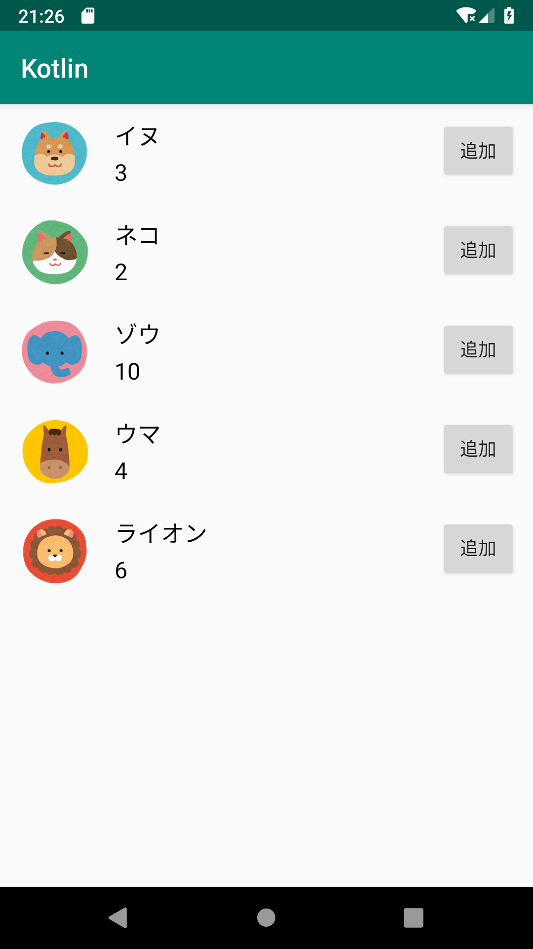
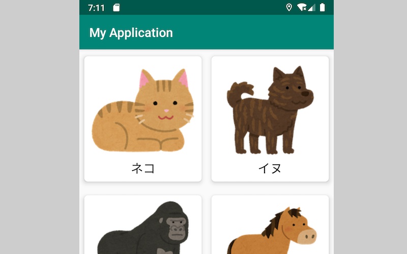
このサンプルコードは、動物の画像、名前、年齢のデータを一覧表示させるものです。
詳しい実装内容に関しましては、以下のRecyclerViewに関する記事でまとめておりますので、あわせてご覧くださると幸いです。
では、CardViewを実装していきましょう。といっても、そんなに難しいことは致しません。list_item.xmlに実装した内容を、CardViewで囲うように修正します。
- list_item.xml
<?xml version="1.0" encoding="utf-8"?>
<androidx.cardview.widget.CardView
   xmlns:android="http://schemas.android.com/apk/res/android"
   xmlns:app="http://schemas.android.com/apk/res-auto"
   android:layout_width="match_parent"
   android:layout_height="wrap_content"
   app:cardUseCompatPadding="true">

   <LinearLayout
       android:layout_width="match_parent"
       android:layout_height="wrap_content"
       android:padding="12dp">

       <ImageView
           android:id="@+id/image"
           android:layout_width="60dp"
           android:layout_height="match_parent" />

       (省略)

   </LinearLayout>

</androidx.cardview.widget.CardView>
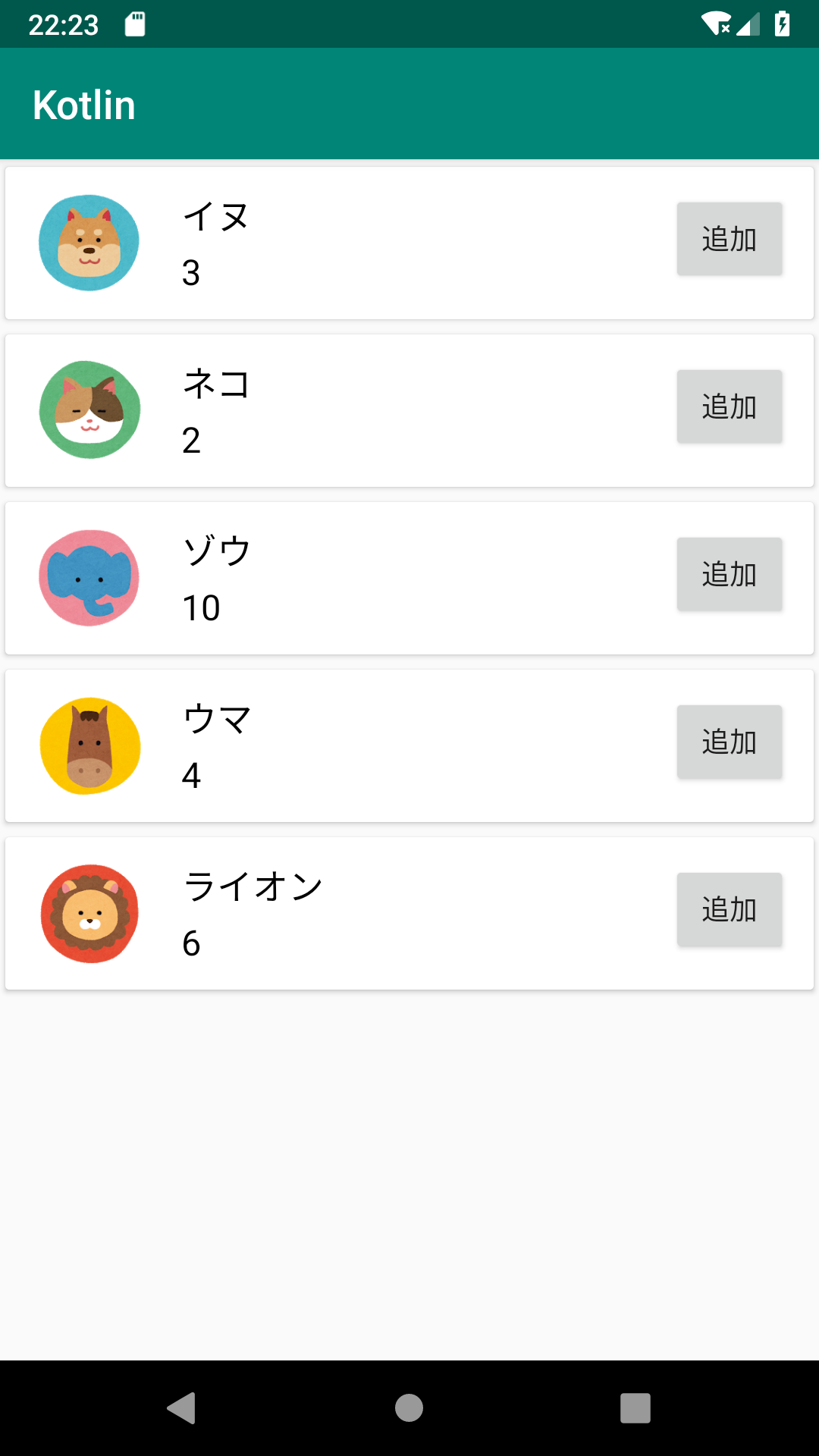
実装したCardViewに対し、app:cardUseCompatPaddingにtrueを指定しております。こうすることで、カードの影が見切れないようにいい感じにカード同士の隙間を空けてくます。
CardViewのカスタマイズ
続いて、CardViewをカスタマイズする方法を紹介致します。
高さの変更
まずは、カードの高さ(奥行き)を変更する方法です。カードの高さは、app:cardElevationで変更できます。
- list_item.xml
<?xml version="1.0" encoding="utf-8"?>
<androidx.cardview.widget.CardView
   xmlns:android="http://schemas.android.com/apk/res/android"
   xmlns:app="http://schemas.android.com/apk/res-auto"
   android:layout_width="match_parent"
   android:layout_height="wrap_content"
   app:cardUseCompatPadding="true"
   app:cardElevation="8dp">

   (省略)
</androidx.cardview.widget.CardView>
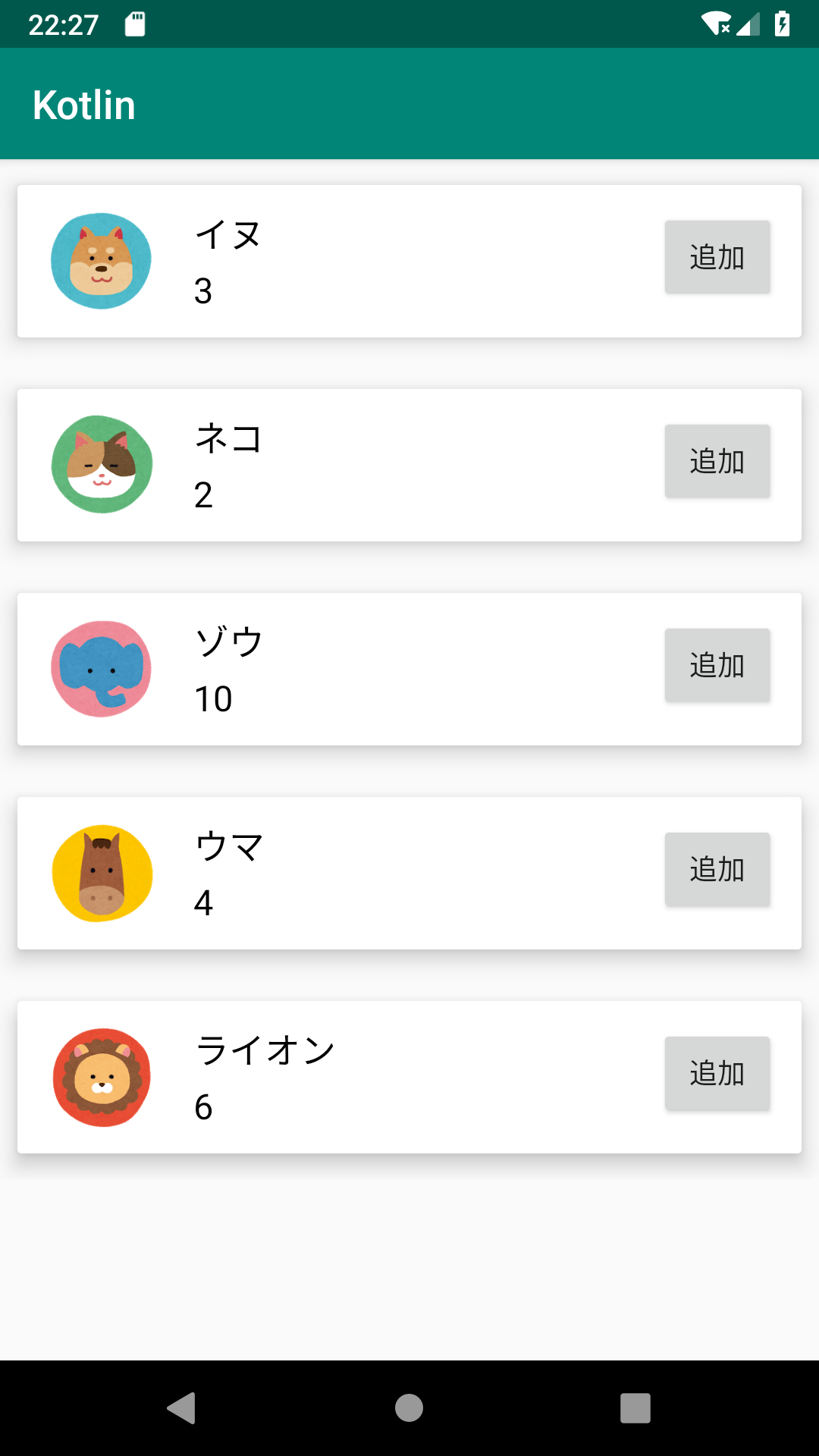
先ほどに比べ、より浮かび上がっているように見えますね。
角丸の変更
続いて、カードの角丸を変更する方法です。カードの角丸は、app:cardCornerRadiusで変更できます。
- list_item.xml
<?xml version="1.0" encoding="utf-8"?>
<androidx.cardview.widget.CardView
   xmlns:android="http://schemas.android.com/apk/res/android"
   xmlns:app="http://schemas.android.com/apk/res-auto"
   android:layout_width="match_parent"
   android:layout_height="wrap_content"
   app:cardUseCompatPadding="true"
   app:cardCornerRadius="10dp">

   (省略)
</androidx.cardview.widget.CardView>

角丸が大きくなりましたね。
背景色の変更
続いて、カードの背景色を変更する方法です。カードの背景色は、app:cardBackgroundColorで変更できます。
- list_item.xml
<?xml version="1.0" encoding="utf-8"?>
<androidx.cardview.widget.CardView
   xmlns:android="http://schemas.android.com/apk/res/android"
   xmlns:app="http://schemas.android.com/apk/res-auto"
   android:layout_width="match_parent"
   android:layout_height="wrap_content"
   app:cardUseCompatPadding="true"
   app:cardBackgroundColor="#FFDDFF">

   (省略)
</androidx.cardview.widget.CardView>
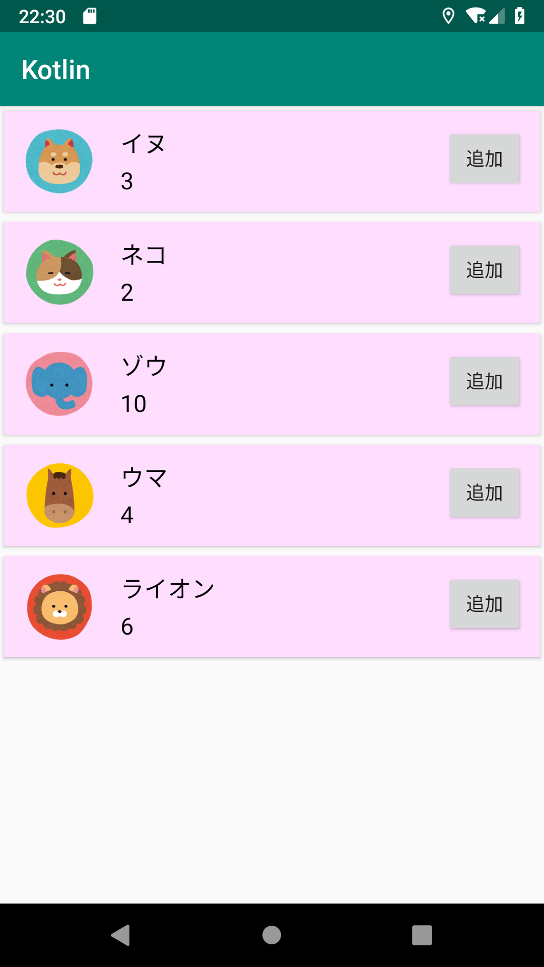
注意しなければいけないのは、android:backgroundでの背景色指定では、背景が変わらないということです。CardViewの背景色を変更したい場合は、app:cardBackgroundColorを使用するようにしましょう。
まとめ

- CardViewを実装するには、ライブラリを追加する
- カード同士の隙間を空けるには、app:cardUseCompatPaddingにtrueを指定する
- カードの高さは、app:cardElevationで変更できる
- カードの角丸は、app:cardCornerRadiusで変更できる
- カードの背景色は、app:cardBackgroundColor
関連記事